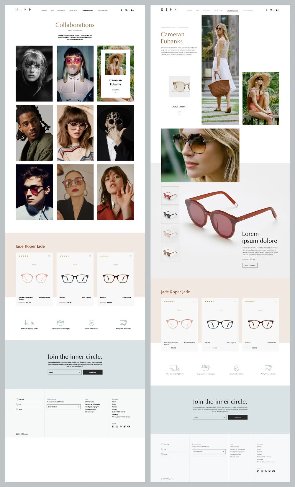
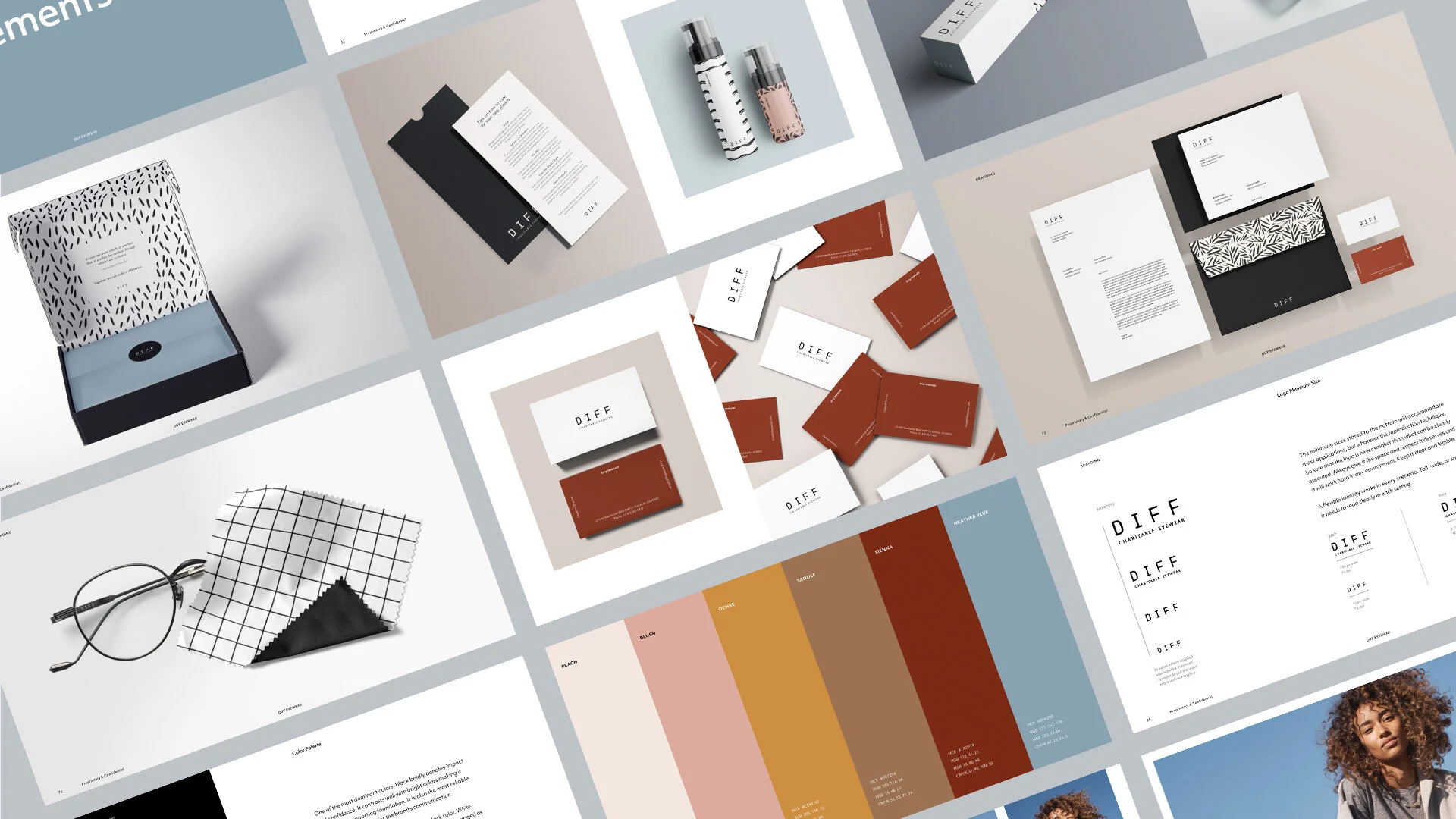
The logo has been refined and adjusted as a part of the refresh for the DIFF Eyewear brand. A part of the reconstruction incorporated the new font, Optima, to maintain the consistency and the connection aesthetically. This ensures recognizable exposure across all marketing materials.
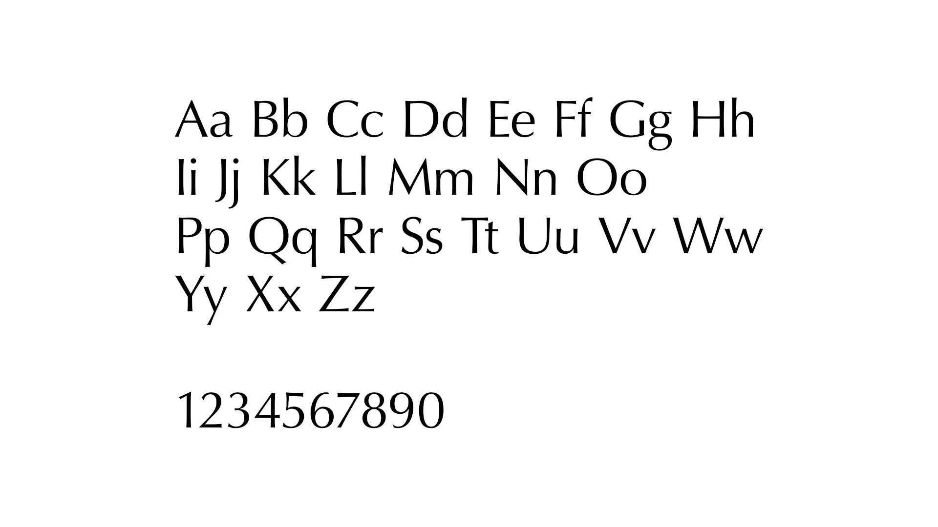
Typography helps to center the brand’s identity and they should be used consistently. To help ensure that all of DIFF’s visual communications are standardized, there are two new typefaces established as the primary and secondary for the refresh of the brand and digital materials. As a rule, use Optima as the headline typeface and Open Sans as the body copy typeface.
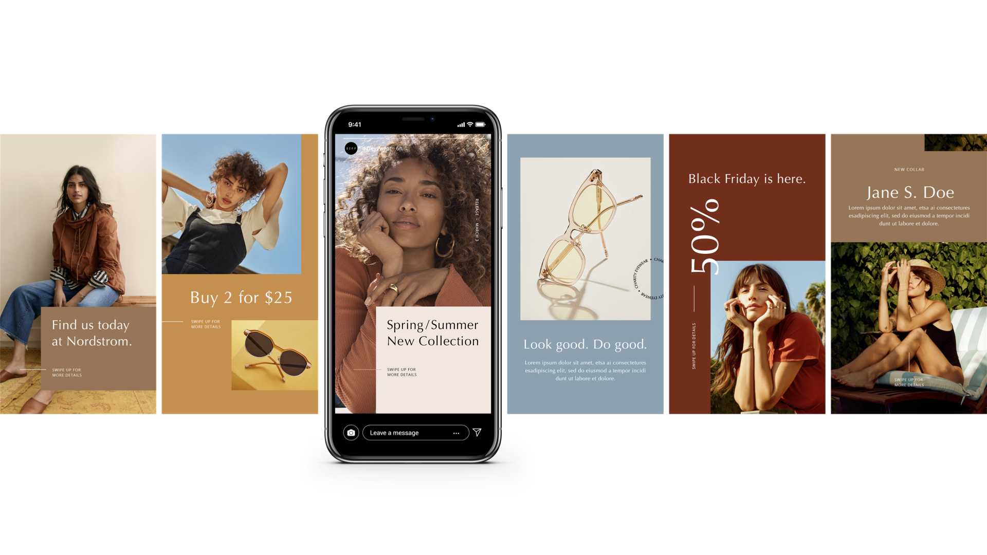
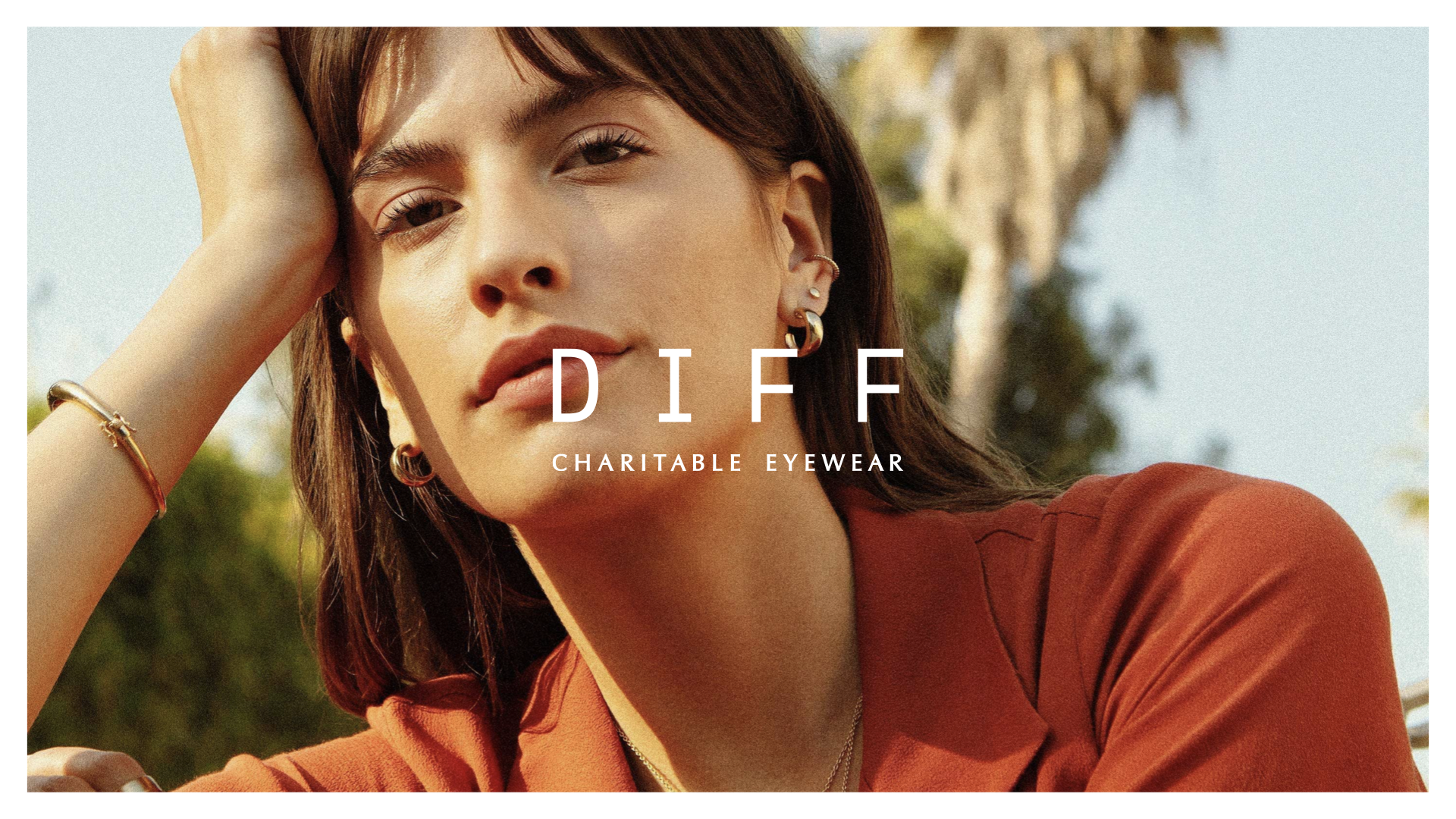
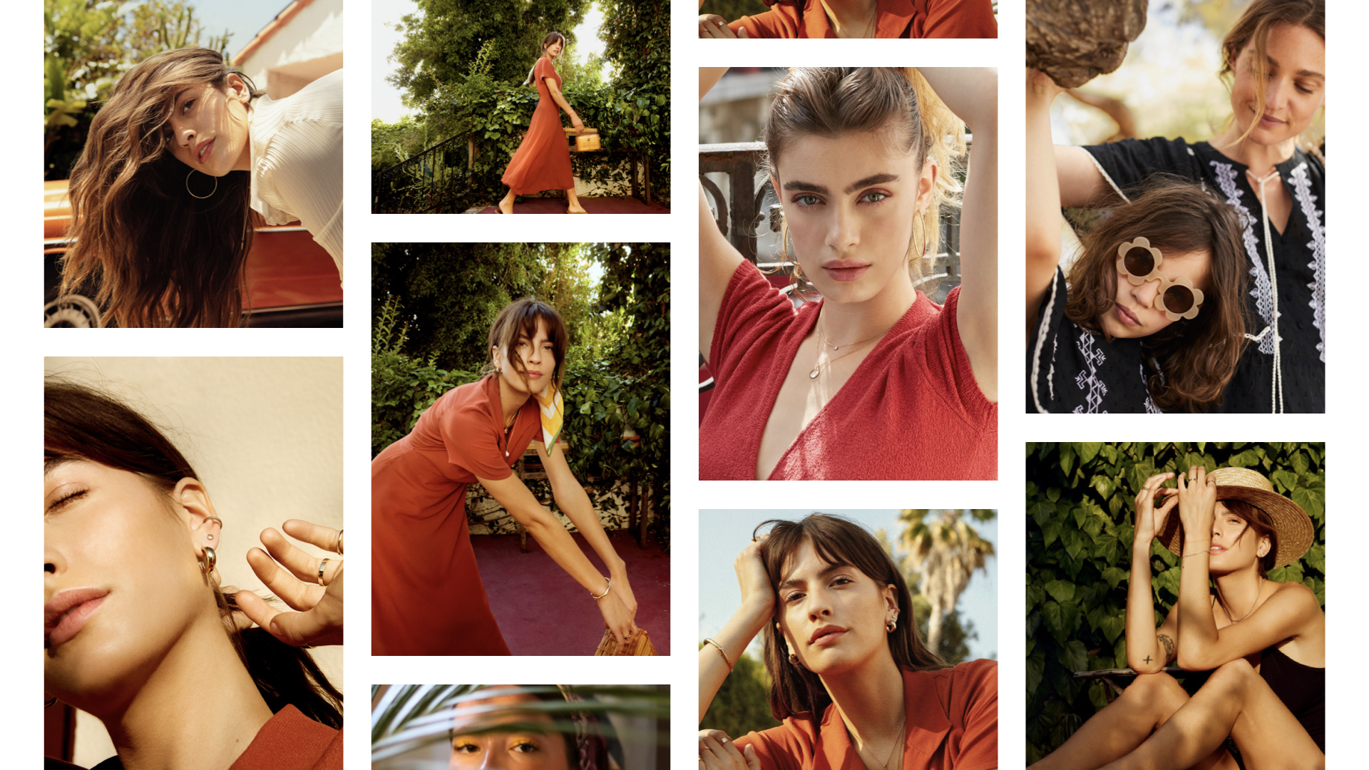
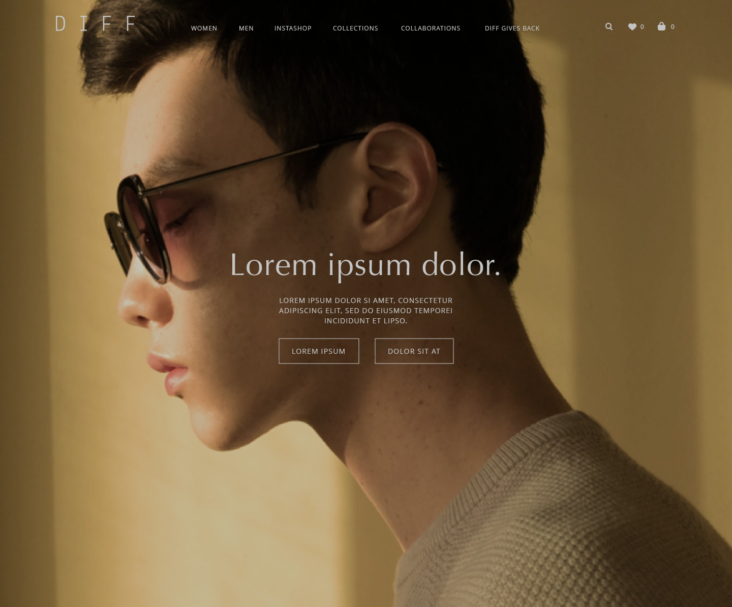
Advised that they revise the art direction of their photography style with a couple mood boards (please see full style guide for more references). The lifestyle photography should feel light, airy, and genuine. It should feature diverse talents in order for the brand to appeal to a broader audience. Talents should have natural looks, without heavy makeup. Poses should not feel forced.
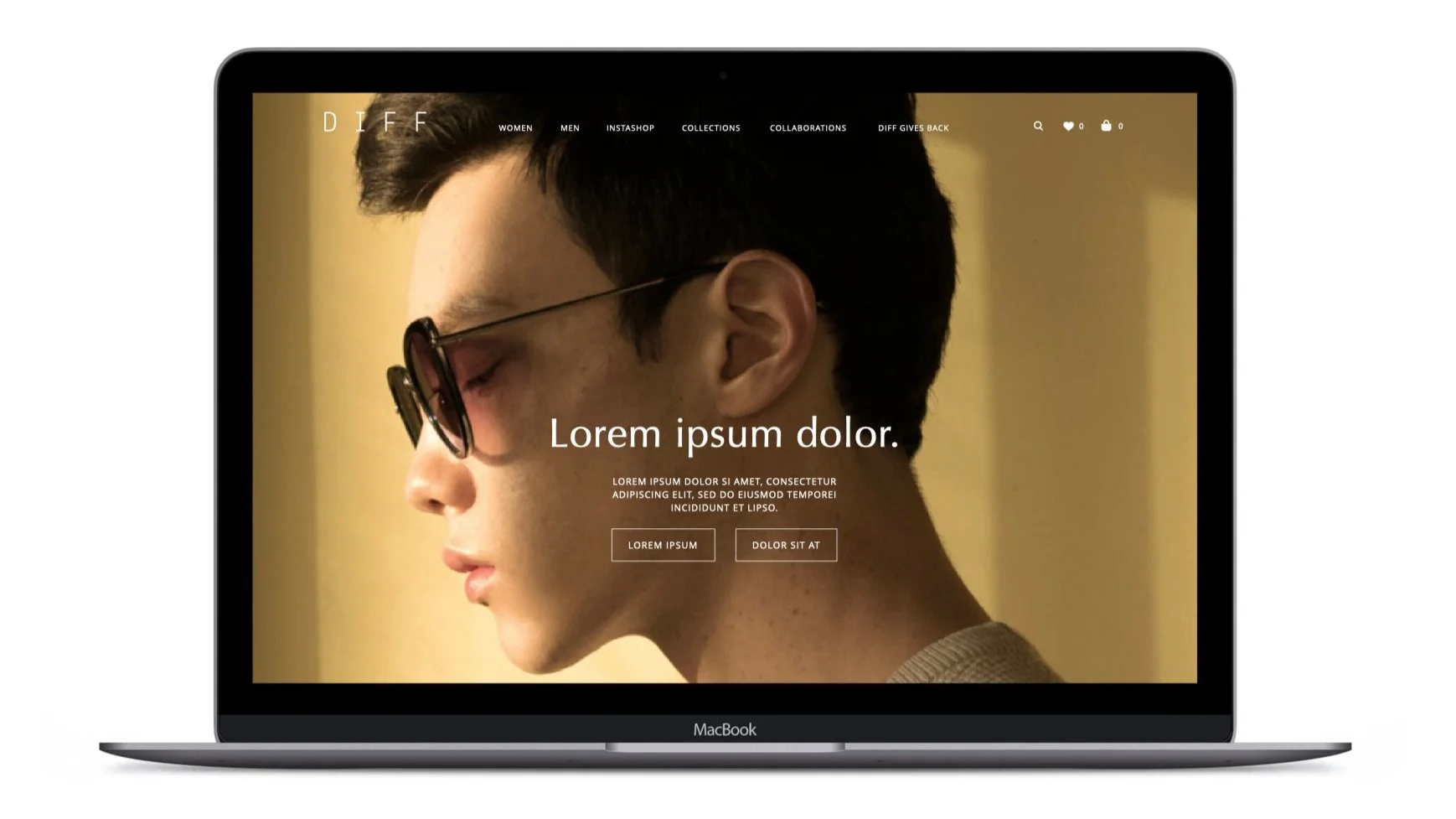
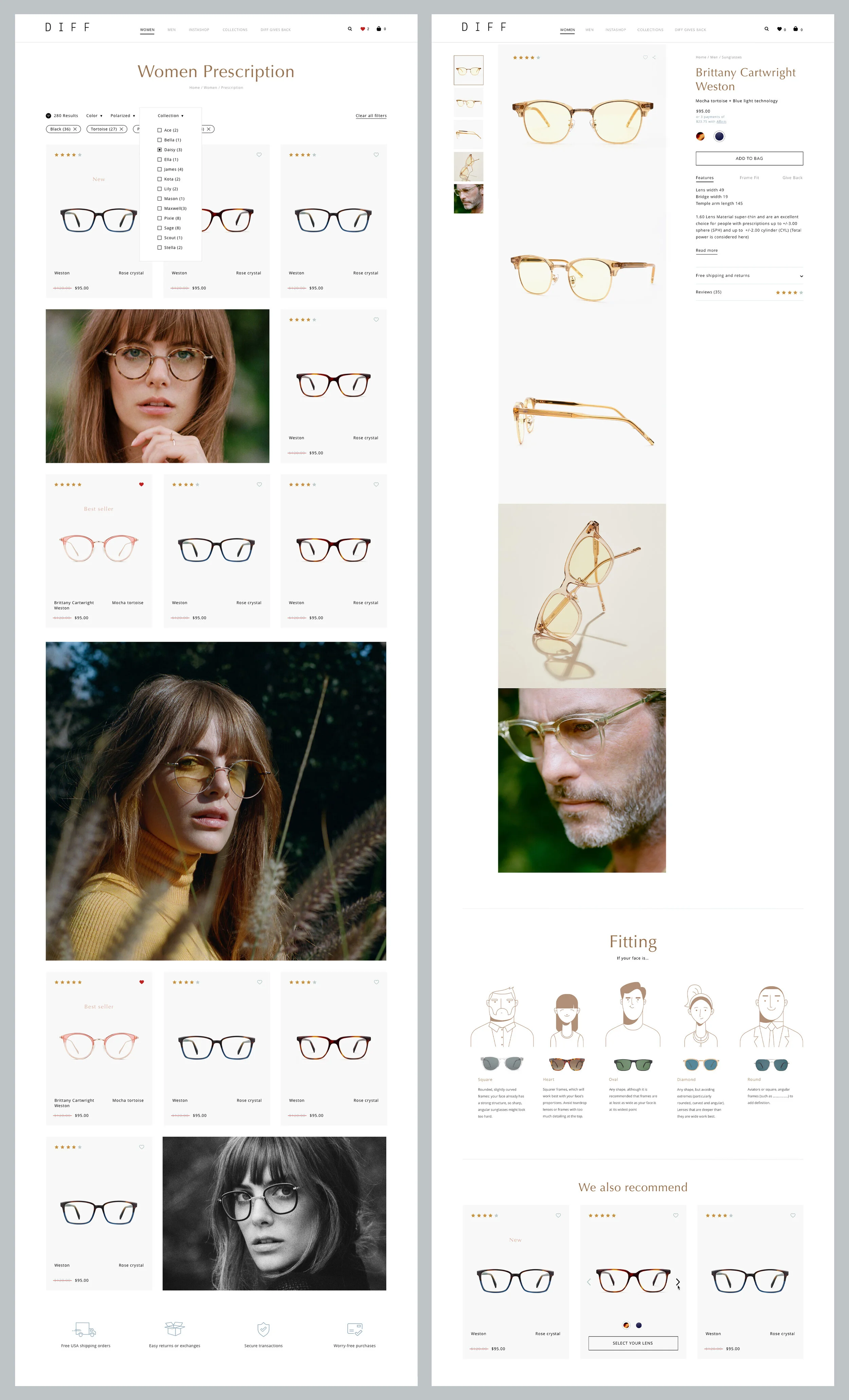
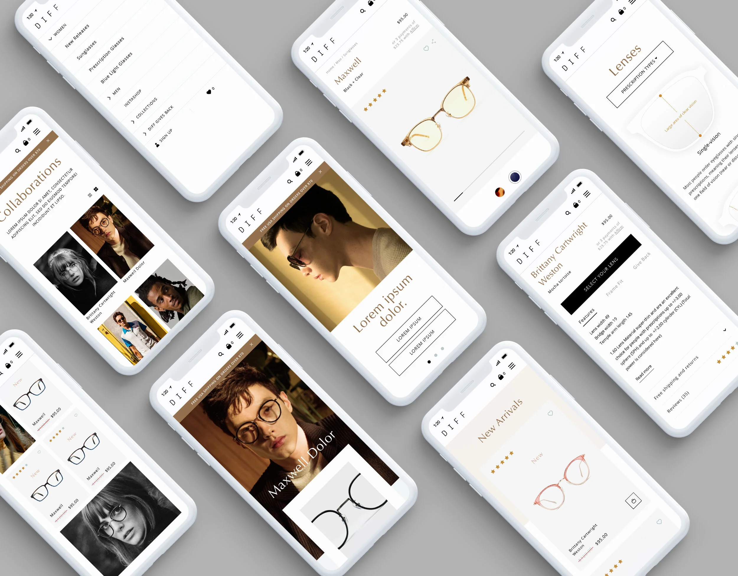
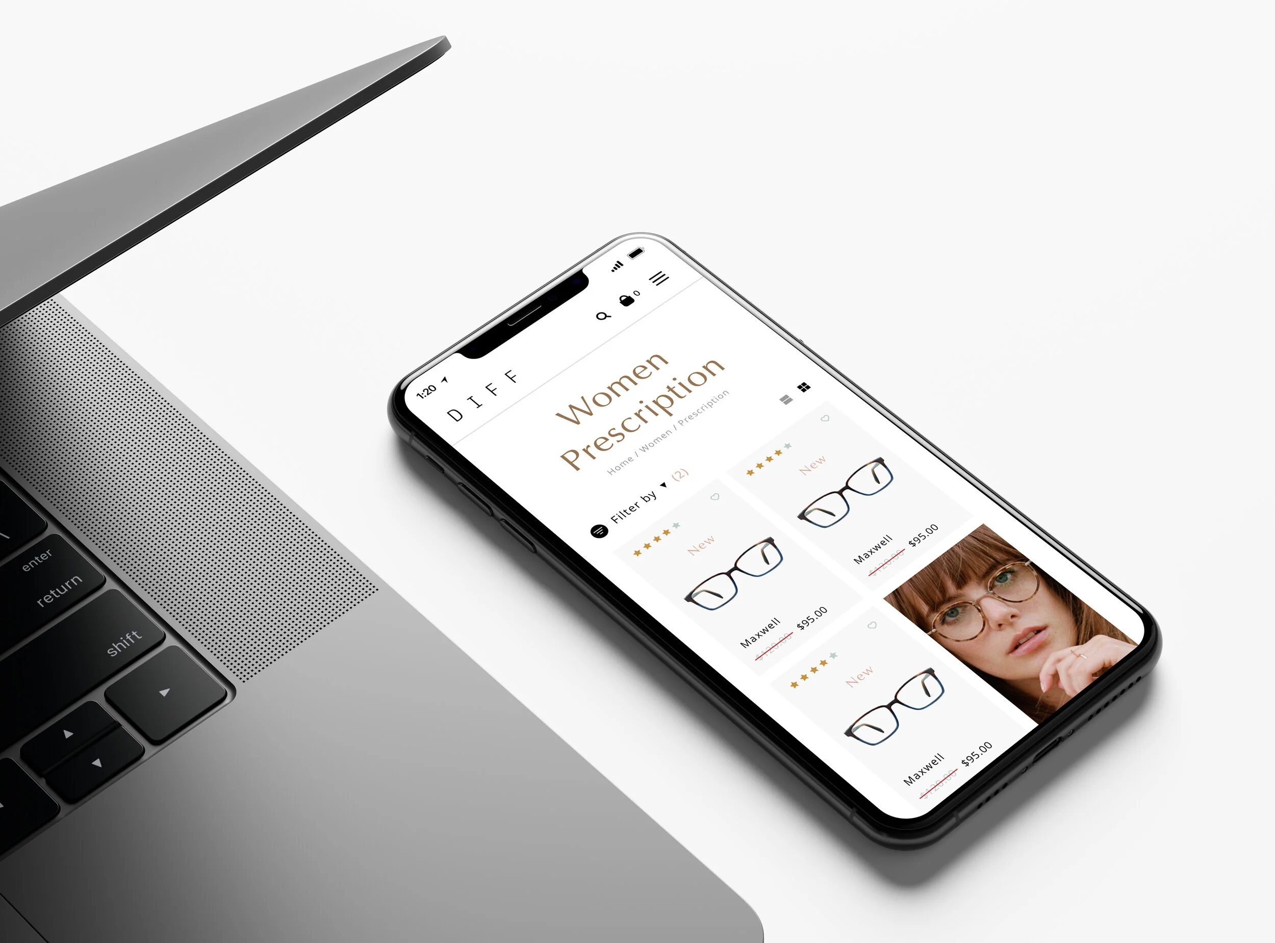
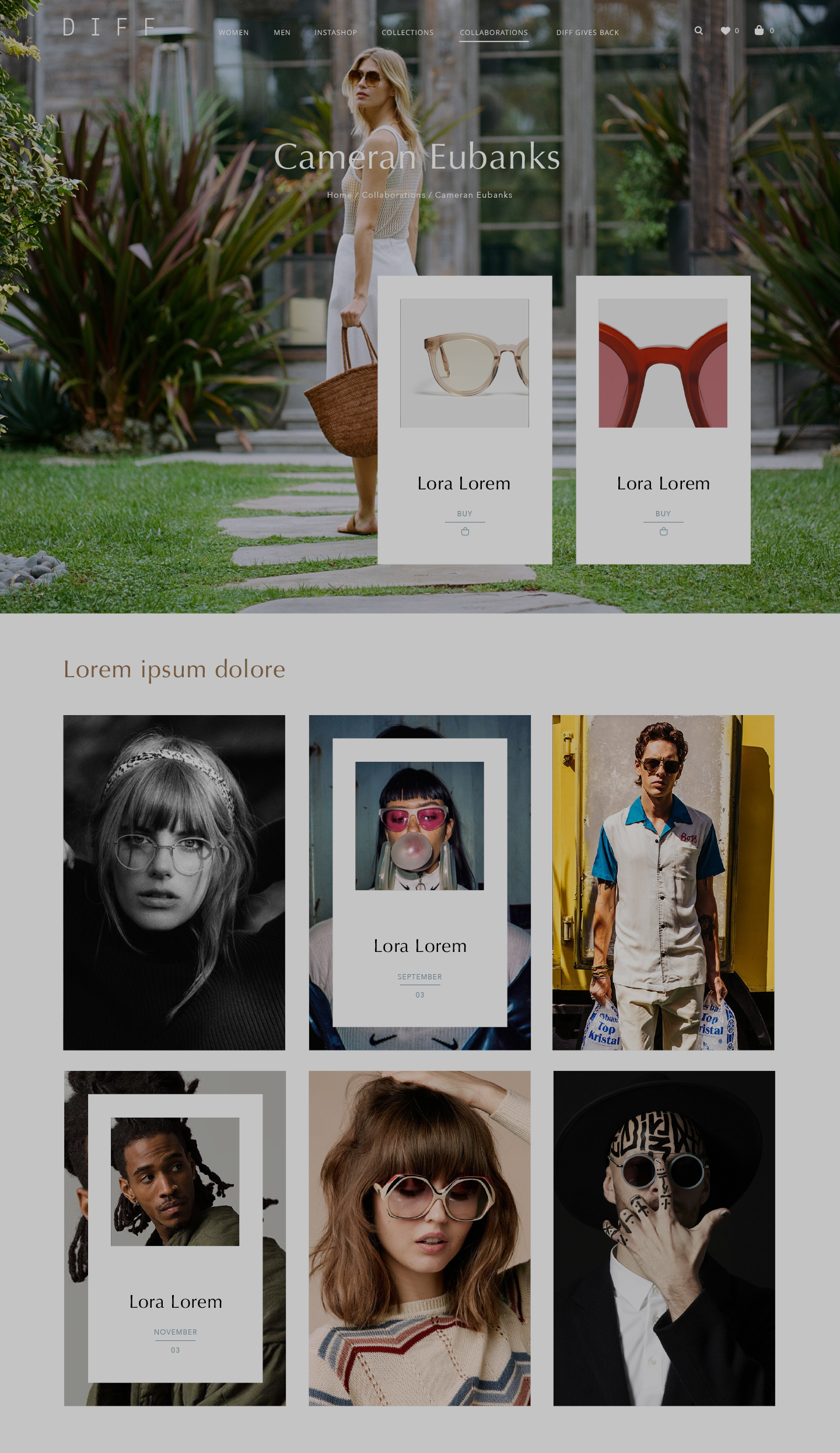
Collaborations landing and detail pages.